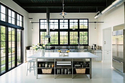
I was perusing Houzz earlier this week like any good design addict does while wasting a little time and came across this photo from Emerick Architects in Portland Oregon. It immediately made me stop and stare for so many reasons. I'd like to point them out to you in my very first installment of "Why It's Great".
- Daylighting.
I'm certain the lights are on in this picture for photography purposes. I guarantee the homeowners don't turn on the lights in this room from sun up to sun down. Added bonus, those windows are beautiful. Using repetition and pattern these windows make artwork unnecessary. - Simplicity
It has loads of beauty because they didn't over-design it. - Big, but not too big.
It's a spacious kitchen, but it isn't overloaded with a crazy amount of cabinets. - Materials.
The stainless steel countertops look sleek and clean, yet accessible and durable. - Ductwork in a conditioned space.
I did a post about this a few months ago. By using ductwork in this way, you can save 15-20% on your electricity bills and also get a smaller HVAC system upon installation.

